Since I am using Yen as my magazine for this assignment I had a look through a couple of issues to look at the type of layout they use. These photos I have taken are layouts that have inspired me and perhaps are ones I wish to use.
This double page spread is an article on band Tegan and Sara. I really love this layout and wish to use it at the start of my editorial. The focal point is definitely on the two girls and your eye just flows from left to right so then you are inclined to read the article. The way they have made the image transparent behind the writing is great because it doesnt make the writing stark and straight on white. It blends with the image and unites into this aesthetically pleasing layout.
A common feature I have found in the magazine is a small interview on a creative that is simple, clean and straight to the point. I was thinking perhaps I could do this style on each of the band members in the editorial as some sort of feature. I like the minimalisation of the page and the stark white margins create emphasis on the photos.
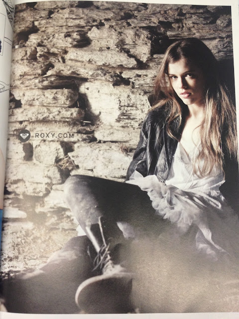
This ad featured in a magazine has an amazing composition that I would like to create in one of the photos of Sophie by herself. The lighting is what makes it so striking but her pose is also really natural.
Another possibility for the opening of the editorial. This one has the white margins all the way around which is a big characteristic of Yen and I liked the flow that your eye is forced to travel. Once again focus is on the left page with the model and then travels right towards the writing.
This one is the other way around and the focal point is straight to the right page. But with the cropping of the image our eye still travels back to the writing. I love the use of different font for the heading as it brings out more personality to the band. the thing I don't like about it though is that its very cut and paste. There is a clear difference of the article and of the picture and besides the heading; none of them blend or mesh together. Its a very distinct distance and I think in mine I want the photos to be more connected with the article.
I love this concept. The three photos conveying movement as they freeze a point in time. The three photos work together well and I could even just have three images of the band interacting and these would connect well in conveying the personality of the band. Again there is the element of the large white margin but this time its only on the top and bottom. So we can see they mix it up with the white space to suit the layout and concept.
This is another option for the opening spread I think. I like how the image spreads over the two pages but not all the way and it allows the eye to travel to the writing. The writing doesnt overpower the spread and is enough to capture the interest of the reader. I would love to have this element in my editorial.


No comments:
Post a Comment